
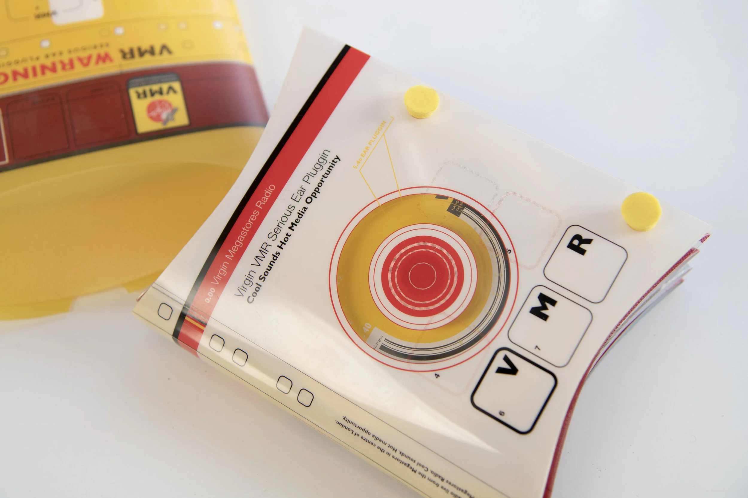
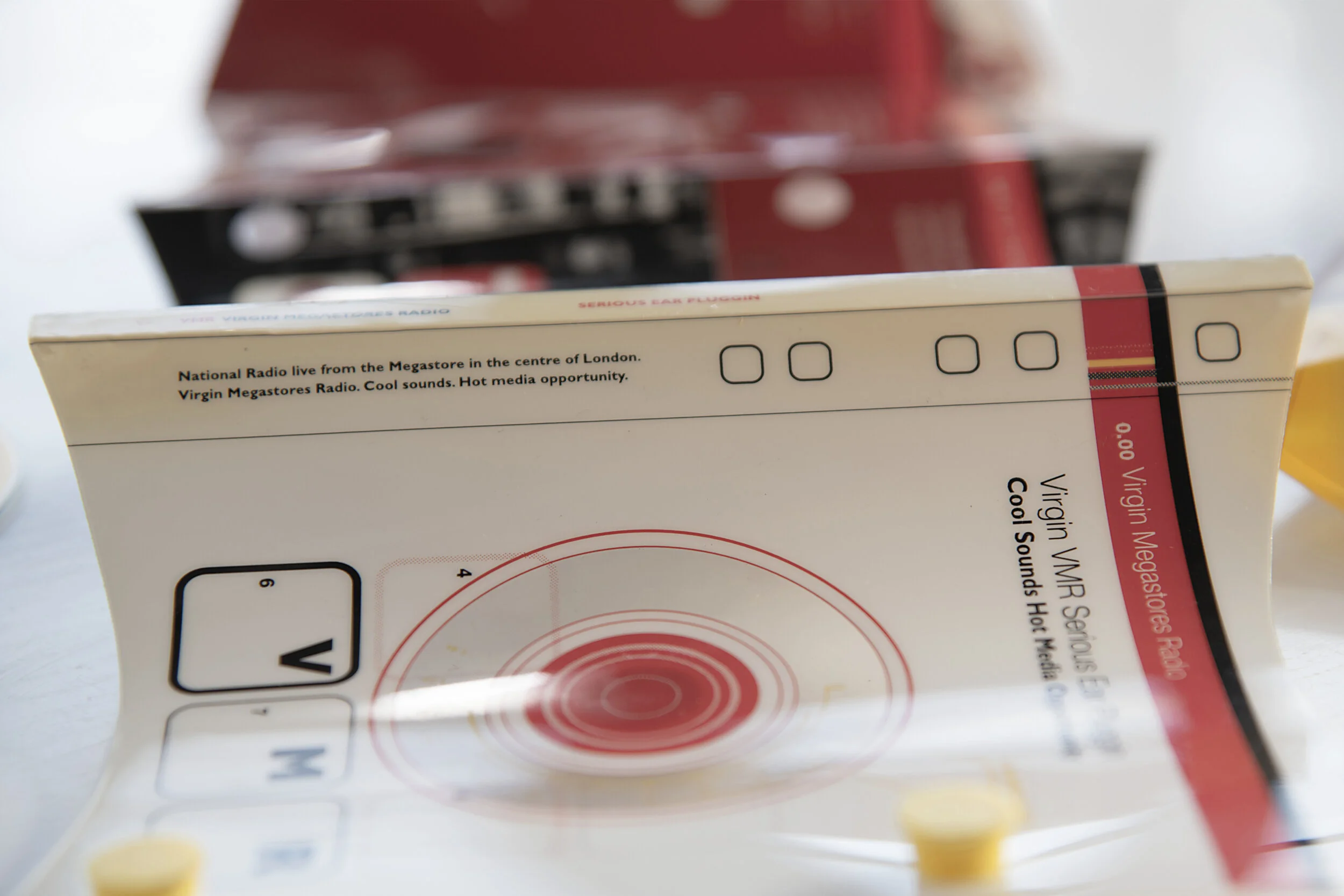
Virgin VMR
Promotional package designed to sell the potential and benefits of Virgin’s in-megastore radio station to prospective advertisers. I came up with the ‘Serious Ear Pluggin’ concept because when customers were in the store, they became in effect, a captive audience. I used actual Ear Plugs to bind the foldout booklet.


Sheppard Robson
Rebrand of an architects to help with repositioning them within their field. One of the younger partners was promoted to the board of directors and wished the firm to be considered on pitches for more forward thinking, innovative cutting- edge builds. The firm was perceived and held a certain position in the market he wanted to change people’s preconceptions and expand their market.
The project consisted of a full re-brand/reposition including the design of a custom typeface based on the logotype which was digitised for use as their own distinct font.


DCMS
Department of Culture Media and Sport
A brochure designed to showcase the importance of the creative industries to Britain, not just from a cultural but a financial perspective.
How to showcase and represent 17 different creative fields with the industry, in a stylish, cohesive, thought provoking, informative and investment enticing way?
I came up with the concept of using ‘shadows’ we take them granted, they cab cover anything, are infinitely variable, dependent on how they are cast, can be subtle intense, large or small. Think about it with the current lockdown, where would we be without the creative industries that; TV series or film you are watching, on-line fitness class you are doing, radio show your listening to or jigsaw your trying to put together. The industry is suffering because of COVID 19 but think how much you would have suffered ALL, of your life, were there no creative industries? Using shadows and projections in the case of the computer gaming industry section to cast shadows allowed me to shoot work in it’s best light and create a look that was consistent but intestinally varied throughout. There was also a lot of information in the form of graphs and charts that had to be shown. This was informational design that I wanted to be in-keeping with the stylish and creative feel of the rest of the brochure, so each and every pie-chart and bar graph was individually designed to fit with the associated industry it was portraying, the Computer Gaming industry, Pac Man themed pie-charts and bar graphs can be seen in the photos. I also used advanced print techniques to achieve the highly-stylised look, integrated tri-tones with UCR, an alternate third colour to differentiate the sections/industries. I also designed the launch event that took place at the design council building then on the Haymarket, you can read from the letter the client was happy and it was well received.


Noise 3.5
I designed the cover, inside cover, slipcase, set the stylistic direction and had work included within this self-published Attik publication. The Attik used to publish Noise, a combination showcase of the best work the company had recently completed with a chance for the designers to do some self-initiated experimental work. At the time, the company was [too]rapidly expanding and needed an updated book to give to prospective clients, putting together a full hard-backed what was now a serious annual Noise, took months so this interim publication was produced.
I based the theme around experimentation, this followed the nature of a lot of the work and provided a great creative framework for the designers to build upon, rather than be constrained by.
The plastic slipcase was screen printed in UV inks [glow in the dark under UV lights] and tabbed to standout on any bookshelf. The cover was printed in a pastel/metallic mix and laser cut to achieve the fine lines. It was supposed to be a client give away, but also went on sale in Zwemmers bookshop with night-time glow in the dark window display.
It sold out on the first weekend of release.


Radioactivity
The Fourth Room, a strategy group headed by Micheal Wolff one of the founding partners of Wolff Olins, approached us, The Attik, to create a book portraying their hypothesis on the future of Radio, the first in a Futurescapes, series of books they intended to publish. Reading this back now, much of what they foresaw years ago, we now take for granted in our everyday life.
I was in the briefing and one of the points Michael Wolff made was that if today radio waves are 2 dimensional sound waves, in the future these will be 3 dimensional waves, carrying pictures and addition visual information to compliment the audio being broadcast. That gave me the idea for the cover graphic, taking the X + Y and adding the Z plane, which I then embossed to add to the dimensional look and give it a tactile enticing feel. They wanted this to be a stand out book, that you would notice on a book shelf but which could also survive sat on a coffee table. The wrapped box gave it presense and protected it on the shelf, when removed the futuristic plastic outer cover protected the book and added a further level of interest. The books overall look and feel was futuristic, but each chapter was designed and shot, or illustrated, to reflect the narrative being told within that specific chapter.
Numerous print and print finishing techniques were employed in its production.


